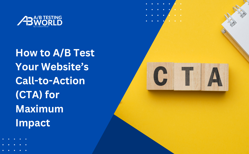
Call-to-action buttons are like signposts for your website visitors.
They say, “Click here.” “Buy now.” “Learn more.”
But just because you put a button on the page doesn’t mean people will click it.
The truth is: most CTAs don’t work as well as we think they do.
Sometimes it’s the wording. Sometimes it’s the placement. Sometimes it’s just the colour that makes people hesitate.
That’s where A/B testing comes in. Instead of guessing which CTA will perform better, you test two versions against each other—and let real users decide.
In this guide, we’ll explore how to A/B test your website’s CTAs the right way, why small tweaks can make a big difference, and what actually moves people to click.
Why Your CTA Might Not Be Working (Even If It “Looks Fine”)
We often assume CTAs are simple—just a few words on a button.
But the reality is CTAs are decision points.
They’re micro-moments where a visitor either takes action… or doesn’t. And that decision is shaped by:
- Clarity: Do I understand what happens if I click?
- Timing: Is this the right moment in my journey?
- Confidence: Do I trust where this will take me?
- Emotion: Does this feel exciting or pushy?
That’s why testing different CTA variations isn’t just a visual design experiment—it’s a way to understand how your audience thinks and what makes them feel comfortable moving forward.
What You Can Test in a CTA
You don’t need to overhaul your site to start testing CTAs. Here are some elements that are surprisingly impactful:
1. The Text (aka the Ask)
The words you choose matter more than you think.
- “Buy Now” vs “Get Yours Today”
- “Start Free Trial” vs “Try it Free”
- “Join Us” vs “Sign Up Now”

Sometimes, switching from command language to benefit-driven language makes all the difference.
2. The Button Colour
Colour psychology is real, but it’s also contextual. Red might mean urgency on one site and danger on another.
Test colours that stand out without clashing. Your goal is visibility, not noise.

3. Placement
Does your CTA show up above the fold, at the end of a product description, or float persistently in a sticky bar?
Test different positions based on how your visitors scroll and engage.
4. Size and Shape
Is the button large enough to notice but not so large it feels like a billboard?
A test between a pill-shaped button and a rectangle might reveal unexpected preferences.
5. Supporting Text
Sometimes, what’s around your CTA influences how people feel about it.
Test short subtext beneath the button—like a reassurance (“No credit card required”) or a nudge (“Only takes 60 seconds”).
How to Set Up a CTA A/B Test (Without Overthinking It)
If you’ve never run a test before, don’t worry. Here’s a simple, step-by-step way to do it—without needing to be a data analyst.
Step 1: Pick One CTA to Start With
Choose a high-traffic, high-intent page. Product pages, landing pages, or pricing pages are great places to start.
Step 2: Create Two Variants
Keep it focused. Change only one element in your CTA—like the button text or colour.
For example:
- Version A: “Buy Now”
- Version B: “Get Yours Today”

Step 3: Split Your Traffic Evenly
Use a tool like CustomFit.ai to evenly divide your website visitors between the two versions so you can track performance without bias.
Step 4: Measure What Matters
Clicks are important, but they’re not the only thing that counts.
Ask:
- Are more people clicking the button?
- Are those clicks leading to actual conversions?
- Are they bouncing after the click?
Step 5: Let It Run
Resist the urge to peek and pick a winner too early. Let the test run at least 1–2 weeks, or until you’ve reached enough visitors to draw meaningful conclusions.
Common Mistakes in CTA Testing (and How to Avoid Them)
It’s easy to fall into traps when testing CTAs. Here’s what to watch out for:
Changing too many things at once
If you change the CTA and the page layout and the headline, you won’t know what actually caused the difference.
Stick to one element per test.
Giving up too early
CTA changes often lead to small, compounding improvements. A 3% increase might not feel like much—until you realise it adds thousands of extra clicks over time.
Optimising only for clicks
If people click… and then bounce, your CTA might be persuasive, but not aligned with what follows. Make sure the post-click experience matches the promise.
Real Examples: How Tiny CTA Tweaks Change Outcomes
Here are a few real-world cases that show just how sensitive users are to the way we phrase and present CTAs:
- A site switched its button from “Get Started” to “Start My Free Trial” and saw a 14% increase in signups. It felt more personal.
- Another brand added the line “No credit card required” beneath their CTA and reduced drop-offs by 8%.
- Simply changing a button colour from grey to orange improved click-throughs by 11%—because it finally stood out.
This isn’t magic. It’s just psychology—and a willingness to test instead of assume.
Where CustomFit.ai Comes In
Testing CTA variations doesn’t have to involve developers or complex setups. That’s where CustomFit.ai helps.
Without writing a single line of code, you can:
- Create multiple CTA versions and instantly run tests on live pages
- Test different CTA experiences for new vs. returning visitors
- Measure which version led to more actual purchases, not just clicks
It’s like giving your CTAs a live audience every time, so the one that wins is the one your users actually prefer.
Quick Tips: Writing CTAs That Connect
Before you even test, here are some simple principles that help CTAs perform better from the start:
- Be specific. “Start Free Trial” is clearer than “Get Started”.
- Use first-person language. “Start My Free Trial” often outperforms “Start Your Free Trial”.
- Match the action to the outcome. If they’re downloading a guide, say “Download the Guide”—not “Submit”.
- Avoid pressure. Users don’t want to be “forced” into anything. Keep it warm and helpful.

Final Thoughts
Your call to action might be small, but it carries much weight.
In a world where attention spans are short and choices are endless, a good CTA is less about pushing people and more about guiding them gently toward what they already want to do.
Through thoughtful A/B testing, you can uncover the phrases, colours, and placements that make your site feel more intuitive. Less guesswork. More connection.
And when tools like CustomFit.ai help simplify the process, you’re free to focus on the real challenge: understanding your users.
Because when your CTAs feel right, people don’t just click—they continue the journey.